
久しぶりの投稿です!
先日、MENTAでとある方から「スライダーの中にスライダー」を実装したいです!とご相談いただきました。
今回は、その際にご提示したコードをご紹介したいと思います。
使用しているSwiperのバージョンは、8.3.1です
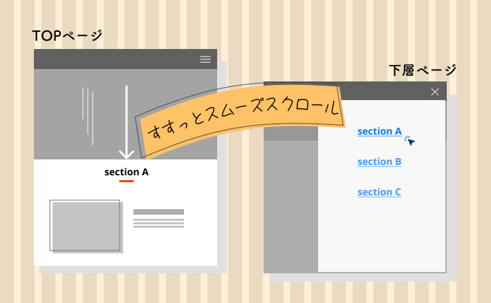
完成形
めちゃくちゃシンプルで必要最低限の要件しか盛り込んでいません。
このコードをベースにして、モーダル内に、画像以外のHTMLを組み込むこともできるでしょう。
上記の完成形では、html上にcssとjsを書いていますので、検証ツールを開きソースコードをご確認ください。
解説
HTMLとCSS
まずはメインのスライダーのHTMLからです。
<div class="main-swiper">
  <!-- Slider main container -->
  <div class="swiper js-main-swiper">
    <!-- Additional required wrapper -->
    <div class="swiper-wrapper">
      <!-- Slides -->
      <div class="swiper-slide">
        <div class="slide js-open-modal" data-slide-index="1">
          <img src="https://picsum.photos/id/1041/800/500" alt="">
        </div>
      </div>
      <div class="swiper-slide">
        <div class="slide js-open-modal" data-slide-index="2">
          <img src="https://picsum.photos/id/1024/800/500" alt="">
        </div>
      </div>
      <div class="swiper-slide">
        <div class="slide js-open-modal" data-slide-index="3">
          <img src="https://picsum.photos/id/1020/800/500" alt="">
        </div>
      </div>

      ︙
    </div><!-- swiper-wrapper -->

    <!-- ナビボタン -->
    <div class="swiper-button-prev"></div>
    <div class="swiper-button-next"></div>

  </div>
</div>
基本的な構造はSwiperのお決まりに則ります。
それについては、公式サイトを確認してください。
そのうえで、モーダルと連携させるために以下の部分を工夫しています。
<div class="swiper-slide">
  <div class="slide js-open-modal" data-slide-index="1">
    <img src="https://picsum.photos/id/1041/800/500" alt="">
  </div>
</div>
div.swiper-slide が各スライド1枚1枚です。
div.swiper-slideの中にもう1つdiv.slideを作り、その中に画像などの要素を格納しましょう。(こうした方が色々と自由が利くため。)
ちなみに、.slideというクラス名はなんでもOKです。
このdiv.slideには、さらに、.js-open-modalと、カスタムデータ属性data-slide-indexが付けられています。
いずれも、このあとモーダルと連携させるためのJSのスクリプトで利用します。
カスタムデータ属性について詳しくはこちら
つづいて、モーダルのスライダーのHTMLです。
<div class="modal" id="js-modal">
  <div class="modal__overlay js-close-modal"></div>
  <div class="modal__content">
    <button class="modal__close-btn js-close-modal" aria-label="閉じる">×</button>
    <!-- スライダー -->
    <div class="swiper modal__slider js-modal-swiper">
      <div class="swiper-wrapper">
        <div class="swiper-slide modal__slide">
          <div class="slide">
            <img src="https://picsum.photos/id/1041/800/500" alt="">
          </div>
        </div>

        ︙
      </div>
    </div>

    <!-- ナビボタン -->
    <div class="swiper-button-prev"></div>
    <div class="swiper-button-next"></div>
  </div>
</div>モーダル全体をdiv.modalで囲み、初期状態では見えないようにしています。
/* モーダル */
.modal {
  position: fixed;
  top: 0;
  left: 0;
  width: 100%;
  height: 100vh;
  padding: 30px;
  display: flex;
  align-items: center;
  justify-content: center;
  transition: opacity 0.3s;
  pointer-events: none;
  opacity: 0;
  z-index: 100;
  background-color: rgba(120, 123, 131, 0.8);
}

/* モーダルがactiveの時 */
.modal.is-active {
  opacity: 1;
  pointer-events: auto;
}
以下は、モーダルが表示されたときの背景用のdivタグです。
また、クラスに.js-close-modalが付けられています。これは後ほど、jsのスクリプトで利用します。
このように、「js-」から始まるクラスをわざわざ作成している理由は、
「jsで利用しているクラスですよ~」と、あとで誰が見てもわかるようにするためです。
また、「このクラスを消したらjs動かなくなるので消さないでね~」という意味も込められています。
<div class="modal__overlay js-close-modal"></div>cssでは以下のようにしてスタイリングしています。
/* モーダル背景のオーバーレイ部分 */
.modal__overlay {
  position: absolute;
  width: 100%;
  height: 100%;
  cursor: pointer;
}
その他、モーダルの中身については特に難しいcssは書いてないのでソースコードをご確認ください。
JavaScript
最後に、jsのスクリプトについてです。
以下が全体のスクリプトです。
const mySwiper = new Swiper('.js-main-swiper', {
  loop: true,
  loopAdditionalSlides: 1,
  navigation: {
    nextEl: ".swiper-button-next",
    prevEl: ".swiper-button-prev",
  },
  breakpoints: {
    600: {
      slidesPerView: 2,
    },
    1025: {
      slidesPerView: 5,
    }
  },
});


// モーダルを取得
const modal = document.getElementById("js-modal");
// モーダルを表示するスライダーを全て取得
const openModalBtns = document.querySelectorAll(".js-open-modal");
// モーダルを閉じるボタンを全て取得
const closeModalBtns = document.querySelectorAll(".js-close-modal");

// Swiperの設定
const myModalSwiper = new Swiper(".js-modal-swiper", {
  loop: true,
  spaceBetween: 30,
  navigation: {
    nextEl: ".swiper-button-next",
    prevEl: ".swiper-button-prev",
  },
});


// モーダルを表示するスライダーをクリックしたとき
openModalBtns.forEach((openModalBtn) => {
  openModalBtn.addEventListener("click", () => {
    // data-slide-indexに設定したスライド番号を取得
    const modalIndex = openModalBtn.dataset.slideIndex;
    myModalSwiper.slideTo(modalIndex);
    modal.classList.add("is-active");
  });
});

// モーダルを閉じるボタンをクリックしたとき
closeModalBtns.forEach((closeModalBtn) => {
  closeModalBtn.addEventListener("click", () => {
    modal.classList.remove("is-active");
  });
});
メインスライダーのスクリプトについて
まず、以下がメインスライダーのSwiper起動のためのスクリプトになります。
const mySwiper = new Swiper('.js-main-swiper', {
  loop: true,
  loopAdditionalSlides: 1,
  navigation: {
    nextEl: ".swiper-button-next",
    prevEl: ".swiper-button-prev",
  },
  breakpoints: {
    600: {
      slidesPerView: 2,
    },
    1025: {
      slidesPerView: 5,
    }
  },
});loopAdditionalSlidesは、loop: trueのときのみ使えるオプションです。
この値はデフォルトでは0ですが、0だとループが滑らかにつながらないことがあるので、1を設定しておきます。
モーダルのスライダーのスクリプトについて
つづいて、モーダルのSwiperに関連するスクリプトが以下です。
// モーダルを取得
const modal = document.getElementById("js-modal");
// モーダルを表示するスライダーを全て取得
const openModalBtns = document.querySelectorAll(".js-open-modal");
// モーダルを閉じるボタンを全て取得
const closeModalBtns = document.querySelectorAll(".js-close-modal");

// Swiperの設定
const myModalSwiper = new Swiper(".js-modal-swiper", {
  loop: true,
  spaceBetween: 30,
  navigation: {
    nextEl: ".swiper-button-next",
    prevEl: ".swiper-button-prev",
  },
});


// モーダルを表示するボタンをクリックしたとき
openModalBtns.forEach((openModalBtn) => {
  openModalBtn.addEventListener("click", () => {
    // data-slide-indexに設定したスライド番号を取得
    const modalIndex = openModalBtn.dataset.slideIndex;
    myModalSwiper.slideTo(modalIndex);
    modal.classList.add("is-active");
  });
});

// モーダルを閉じるボタンをクリックしたとき
closeModalBtns.forEach((closeModalBtn) => {
  closeModalBtn.addEventListener("click", () => {
    modal.classList.remove("is-active");
  });
});
まず、モーダルとメインスライダーを連携するために必要な要素を取得します。
// モーダルを取得
const modal = document.getElementById("js-modal");
// モーダルを表示するスライダーを全て取得
const openModalBtns = document.querySelectorAll(".js-open-modal");
// モーダルを閉じるボタンを全て取得
const closeModalBtns = document.querySelectorAll(".js-close-modal");
次に、モーダル内に含まれているスライダーを起動します。
// Swiperの設定
const myModalSwiper = new Swiper(".js-modal-swiper", {
  loop: true,
  spaceBetween: 30,
  navigation: {
    nextEl: ".swiper-button-next",
    prevEl: ".swiper-button-prev",
  },
});
ここまでは普通ですね。
ここからがポイントです。
// モーダルを表示するスライダーを全て取得
openModalBtns.forEach((openModalBtn) => {
  openModalBtn.addEventListener("click", () => {
    // data-slide-indexに設定したスライド番号を取得
    const modalIndex = openModalBtn.dataset.slideIndex;
    myModalSwiper.slideTo(modalIndex);
    modal.classList.add("is-active");
  });
});ここでは、先ほど取得したopenModalBtns(メインスライダーの各スライド)1枚1枚に対して、foreachを使って、clickイベントを付与しています。
メインスライダーの各スライドは、カスタムデータ属性を持っていましたね。
そこで、以下の記述により、1枚1枚それぞれに付与されたカスタムデータ属性の値を取得しています。
// data-slide-indexに設定したスライド番号を取得
const modalIndex = openModalBtn.dataset.slideIndex;
取得できたら、「カスタムデータ属性の番号と一致するモーダルのスライド」を表示するようにします。
myModalSwiper.slideTo(modalIndex);slideToは、指定したインデックス番号のスライドへ移動するためのメソッドで、Swiperに搭載されているメソッドです。
最後に、モーダルを表示するためにis-activeクラスを付けています。
modal.classList.add("is-active");モーダルを閉じるスクリプトについては以下です。
// モーダルを閉じるボタンをクリックしたとき
closeModalBtns.forEach((closeModalBtn) => {
  closeModalBtn.addEventListener("click", () => {
    modal.classList.remove("is-active");
  });
});先ほど取得したcloseModalBtns(背景とスライドの×ボタン)の1つ1つに対して、clickイベントを付与しています。
背景と×ボタンのいずれかをクリックしたら、is-activeクラスを取り、モーダルを消しています。
【おまけ】スライダーの入れ子
モーダル表示されたスライドに、さらにスライドが入れ子になっているケースもご用意しました。
簡単に説明すると、モーダル側のHTMLを以下のように変更しています。
<div class="swiper modal__slider swiper-main js-modal-swiper-main">
  <div class="swiper-wrapper">
    <div class="swiper-slide">
      <div class="mainSlide">
        <div class="swiper js-modal-swiper-sub">
          <div class="swiper-wrapper">
            <div class="swiper-slide">
              <div class="subslide">
                <div class="subslide-media"><img src="https://picsum.photos/id/1041/800/500" alt=""></div>
              </div>
            </div>
            ︙
          </div><!-- /swiper-wrapper -->
          <div class="swiper-pagination-sub"></div>
        </div>
      </div>
    </div>
  </div>
</div>div.mainSlideを新たに用意し、その中にさらにSwiperのHTMLのひな型を挿入しています。
あとは、jsで.js-modal-swiper-subに対してSwiperを起動させればOKです。
const myModalSwiperSub = new Swiper(".js-modal-swiper-sub", {
  spaceBetween: 30,
  grabCursor: true,
  nested: true,
  pagination: {
    el: '.swiper-pagination-sub',
    clickable: true,
  },
});